Week 13: Graphic Identity

Re ection: re ect on how Graphic Identity can in uence the public perception of a Project.

Logos/graphic identity are iconic, they are how a company or even a person is identified. we think of brand such as coco cola with their signature font or Cadbury with their exclusive purple. With these popular brands especially they have been so committed to their graphic identity that when people see the colour red or the specific font the will think of the product with out it being directly referenced.

I think our graphic identity is so important in giving a glimpse into the way our team conducts ourselves. Our original logo was very cool and fun and playful however not the sophisticated impression we want on approaching clients.

1

We wanted something to show we are confident and reliable not childish and fleeting, but also show our humours and creative personality that is matched with our colour palette.

colour-swatch

Here is what some of the team came up with:


Here is my final graphic identity pieces incorporating our colour swatch, hexagon studio tile and name.

jobachjsjuntitled-4

Week 12: Graphic Identity.

When I was trying to look for inspiration for the graphic identity assignment I was sitting in our studio which has been the hub for our project team over the past semester, originally an old bathroom, I noticed the tiles and the hexagon formation. This was what i based my design off.

img_2551

I also created this image of a building on Karangahape road which I made a colour swatch of, we are most likely going to use in our digital publication so I decided to also use this colour palette.


Here is my concept drawings, I tried to also include the hexagon tile shape into the design.

Week 11: Collage as Design Analysis.

For this weeks in class assignment using collage as design analysis, I decided to expand on a project I researched in Story. My research project was designing advertising material for a childrens camp. The design is a collage of many icons that appeal to children as fun with the overlay of the word BRAVE. I researched this design and envisioned what I wanted it to look like but it was never realised. However, today for my collage analysis I have decided to put feet to my design.

The analysis is really of what makes up a childrens idea of fun, what gets them excited.

Below is my concept drawing and development process:

screen-shot-2016-10-18-at-4-57-50-pmscreen-shot-2016-10-18-at-4-58-14-pmfinal

I started with just doing a collage and used more yellow images than other colours. I finally added the writing over top in trash hand font in white. I also played round with the different colour hues, and I think this would look cool as a series of different colours. The only thing I would of done differently was to make sure all the icons were the same texture including the writing.

Week 10: Every Object Tells a Story

This week I was hugely inspired by an creative Instagram account called Lauren.creative. I like the way that she incorporates typography into images as a border or shape words in a way that is becomes the object or focal point. I would really like to do something similar for this weeks assignment.

screen-shot-2016-10-10-at-5-01-09-pmscreen-shot-2016-10-10-at-5-04-20-pmscreen-shot-2016-10-10-at-5-04-35-pm

I attempted to recreate the wing image but using moving picture and some footage I previously took of my sister at Maraetai Beach where we live.

I tried to choose a font that was youthful but relaxed that would reflect the beach scenery.

However it proved too time consuming and I believe I was too ambitious, and unskilled to accomplish the dream.

I opted for placing the writing within the body and on the mountains.

Here is the final image. I chose the white font as it was a clear but gentle contrast still keeping with natural colours, in contrast to a primary colour, and black I thought would be too harsh. I found the font was relaxed and worked with the beach vibe; it almost seems hand written. I also like how it stretched and moulded to the hills in the background.

typography

The text I chose is a Psalm from the the bible, psalm 95 is a poem written about the craft work of Gods hands in forming the dry land and the separation from the sea.

For the Lord is the great God,
    the great King above all gods.
 In his hand are the depths of the earth,
    and the mountain peaks belong to him.
The sea is his, for he made it,
    and his hands formed the dry land.

Come, let us bow down in worship,
    let us kneel before the Lord our Maker;
for he is our God
    and we are the people of his pasture,
    the flock under his care.

I chose this particular passage because of the two lines I have highlighted. Nothing makes me feel as small as when I stand beside the sea and I am forced to question that there must be something bigger than me. Scale helps portray this in the image.

I wish I had had the time to develop my first idea of making a rotoscope image of words forming wings in the moving picture.

Week 9: Lighting and Photography

I used many different types of lighting in this exercise including day light on a overcast day, a iPhone torch, a candle/fire, house lighting, my laptop screen and diffused lighting through thin yellow curtains.

I learnt that the different lighting can create different moods in the picture, just as warm and cool light.

I need to work on my photography skills and learn more about settings on a camera however, for this exercise I used my iPhone camera.

This expertise was also helpful in filming our interviews for our project especially with tim as we interviewed him in his office which was large tinted windows which gave a artificial blue tint to the room.

Warm house light bulb

img_0295

iPad screen light, cool and dull.

img_0296

Candle light

img_0293

Day light on a overcast day

img_0290

Iphone touch light. This is my favourite image.

img_0291

Day light diffused through lemon curtains.

img_0294

Candle light again

img_0292

Week 8: Exploring Space and Proportion

I am so blessed to live in such a beautiful place in New Zealand that is Maraetai beach. For scale and proportion my sister Taylor and I went down to the beach at mid tide and I was just filming her not doing much really.

maraetai-beach-2014

I wanted to show the vast sea, and clear skies, the sky and sea acting as two clear half. The day was perfect to both sky and sea were spotless and blue.

I liked how the wide open spaces are amazing and beautiful to look at, however, once one person, in this case my sister was put in the frame she instantly became the focal point no matter how small she was. There was one shot in particular that I cut because I wanted a scenery shot yet a seagull turned out to be the focus even though it was so small and seemingly insignificant.

I find just siting at the beach and watching after a while you can become oblivious of everything. Although there is lots to look at because they are open spaces it feels like you’re staring at nothing.

I wish I had taken more consideration of proportion in this exercise as I noticed while editing how the shore, sea and sky created perfect third in the frames or half when just the sea and sky divided by the rolling hills of the coromandel peninsula.


screen-shot-2016-10-25-at-10-03-11-pmscreen-shot-2016-10-25-at-10-03-00-pm

Week 7:Exploring Space and Proportion

One of the best uses of scale in my opinion is the cold play music video Up and Up. Their imagination in this video is amazing, in just the 1st 20 second the golden gate bridge is seen in a pond, a dish sponge is a football field and a tea cup is a swimming pool. The surrealism is perfect and creative.

I also took this picture of my friends at Sylvia park because I thought this was a cool example of scale in product and interior design. I think scale is a essential and effective tool in interior design

img_2545

Recently on House Rules they were challenged to transform a apartment for leukaemia patients, however they were very very small rooms and I thought that the Kitchen by Fil and Ryan was a extremely good use of space and their management in the scale and proportion of every element was wisely chosen to make the space fully operational and functional in a small space. I especially thought the idea of the breakfast bar with the slanted bench top was a good use of space and functionality.

Lastly, Proportion in graphic design particularly in lettering, the way these designers have used letter makes the characters also act as the image, the OK one is great.

Week 5: Communicating Ideas

Although I would consider communication one of my strengths I have found myself struggling with how to communicate and effectively explain ideas and concepts that are incomplete and beyond my skill set.

Paul has helped us with this idea and really it comes back to the old rhyme, ‘how do you eat and elephant? one bite at a time’. I now understand that its ok to not have my ideas set in stone and realisation before presenting them. In fact sometimes the only way we can actually make and construct or make plans is when we share them and we involve other people and their expertise.

So in trying to communicate our ambitious project concept I have broken it down into ‘bite’ sizes in the way of story boarding.

The images below are draft plans of a slide presentation of our project concept to be presented on the 1st of September. Our group has chosen to collaborate via google docs (this can be seen here: http://bit.ly/2bvtbFh )

IMG_2069IMG_2071

After making this story board I then decided to film the interactive website the block as a visual illustration of our inspiration. I time lapsed it and the video will be embedded to our presentation but is also shown here:

I found these images to add to our collaborate slides and am pleased with the progress so far Screen Shot 2016-08-29 at 3.33.53 PMScreen Shot 2016-08-29 at 3.34.03 PM

I found it very helpful and a release of stress to be able to learn how to visually communicate my ideas so people can better comprehend them and also get involved themselves.

It is imperative for our project group to communicate our plans as our concept is beyond our current skill set, however, we believe our kiosk could be a great asset and attraction to the Kroad business association.

Week 4: Drawing as research

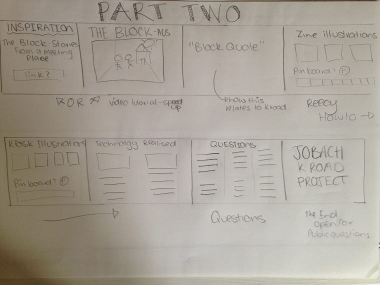
This week we were challenged to use images we had taken a in week two as research. The excerise including mapping geographical area or maybe bit harder but looking at situationist maps. Situationist maps focus to locating what is not usually seen in contrast to a road map showing street names and building. Joseph Hart defines it as

“a whole toy box full of playful, inventive strategies for exploring cities… just about anything that takes pedestrians off their predictable paths and jolts them into a new awareness of the urban landscape.” 

(Hart, Joseph (July/August 2004). “A New Way of Walking”. Utne Reader.)

IMG_1791.jpg

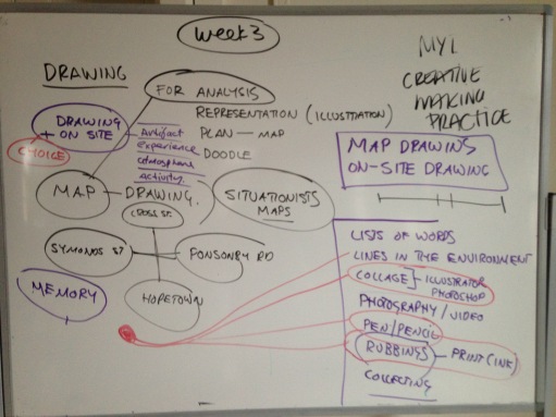
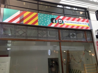
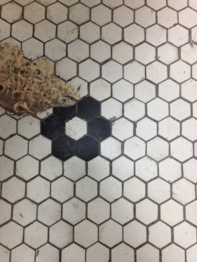
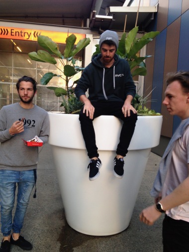
I thought I would take a bit of a risk with this weeks ICA and make this a valuable contribution to my project research of technology not knowing wether of not it would pay off. Being inspired by this picture below of Matchbox studies in Myers park, I decided to make a situationist map of the value of social media on Karangahape road based on the display of social media icons and referrals on shop windows as you can see in the image below.

IMG_1631

So firstly, I went through all of the photos I took of K road to see if I saw any other social media icons, then I went through other class mates blogs and did the same. These are the images I found.

The results were not many. At this point I felt like giving up because its was taking me a long time to find enough material to work with.

Next I headed to google, google streets and images to be exact with the intent of finding more images.

I found no more and felt like I wasted another hour. But I was determined to get enough results to make a map.

Out of frustration I decided to go the the most relevant search engine: Facebook, stumbling upon The K road business associations page I found many links to businesses and personalities of K road. https://www.facebook.com/KRoadNZ/

Here are a few:

https://www.facebook.com/lifewisemergecafe/?hc_ref=PAGES_TIMELINE

https://www.facebook.com/VadaHair/?hc_ref=PAGES_TIMELINE

https://www.facebook.com/theburgerbarkrd/

https://www.facebook.com/NomNomPanda/

And there was obviously many more. I screen shot all their Facebook profile pictures, printed them out and compiled them into a map.


Im not entirely happy with the final result. But I guess that why they call it a risk – because you don’t entirely know what the end result will be.


Week 3: Drawing for Analysis

I commend the lectures for adapting our class content and class assignments to better align with our project development. Through this exercise I have made some very valuable discoveries to contribute to our project development, specifically the art of rotoscope.

IMG_2056


I am still so surprised at the many different unique spaces of K road. I love walking around and finding little gateways to new places like the brick archway I traced.

In my drawing process I would describe the historical buildings and architecture of Karangahape road in two words: 1. liney, What does that mean? well I had to use a ruler a lot, the buildings were very tall, symmetrical and boxed. Secondly, I found they were very detailed as seen in the drawing of Hopetoun Alpha’s decorative detail of the celling and the baptist tabernacle pillar tips. This is a lot of work for a labour and I wonder if that is why we don’t see as much of this work made today, in contrast our modern day architecture seems to be as minimalistic as possible, easier and faster to make.

This weeks ICA has caused me to notice a few things about the architecture and environments of K road. Through this exercise I was also introduced to the art of rotoscope and animation which is a style that our group has decided to incorporate into our project. I started looking into rotoscope and found some cool resources that are very similar to this ICA.

From this inspiration of this video I decided to make an animation video using rotoscope animation on photoshop, which I google tutorials for. This video is to promote an upcoming national conference for a childrens program that I help run. Please ignore the message, even watch on mute if you like but see how the tracing exercise inspired me for this video.