Week 13: Graphic Identity

Re ection: re ect on how Graphic Identity can in uence the public perception of a Project.

Logos/graphic identity are iconic, they are how a company or even a person is identified. we think of brand such as coco cola with their signature font or Cadbury with their exclusive purple. With these popular brands especially they have been so committed to their graphic identity that when people see the colour red or the specific font the will think of the product with out it being directly referenced.

I think our graphic identity is so important in giving a glimpse into the way our team conducts ourselves. Our original logo was very cool and fun and playful however not the sophisticated impression we want on approaching clients.

1

We wanted something to show we are confident and reliable not childish and fleeting, but also show our humours and creative personality that is matched with our colour palette.

colour-swatch

Here is what some of the team came up with:


Here is my final graphic identity pieces incorporating our colour swatch, hexagon studio tile and name.

jobachjsjuntitled-4

Enter/Prof Week 13 (1st November )

Our last class, and still not a live ecommerce website. Quite disappointing as I was hoping this could be something that would be presented and we could be proud of and also use on our portfolio or CV.

However, I feel very proud of the Brand team, we have accomplished everything that was required from us and gone beyond the expectations. I commend the few brand team members that were reliable, diligent, and interactive.

Collectively we wrote a brand and strategy manual as part of the course requirements with the help and advice from guest lecturer Ben. I have revised and restructured the Brand manual to a finished standard.

https://public.3.basecamp.com/p/QE4pJrdYbdVStDrpsihGn5SK

Lastly, we talked to the web design team and discussed cropping images and watermarks, here is the message I posted to address this, it was later discussed in full and Ben agreed with us and offered some valuable advice from his experience.

screen-shot-2016-11-14-at-7-07-05-pm


Week 13 (October 31)

I am reminded with the upcoming USA presidential election how a variety of people can look, see and hear the same thing but yet interprete a message so differently.

In any design we make it there is always a chance of it being narrated and interpreted differently that its intended message. We see this time and time again in advertising and commercials when companies release some work that is found to be affensive by some people. I remember when Selena Gomez performed at a MTV music awards show with a hindu bindi and many people backlashed calling it culturally offensive.

Read more at this link:

http://www.huffingtonpost.com/2013/04/16/selena-gomez-bindi-mtv-movie-awards_n_3092129.html

Designers have a large influence especially in media production and media has a large influence of perspectives and opinions in communities, we need to be very intentional with every detail to ensure the message we intend is maintained.

Today in class we were specifically talking about photography and the narrative of the viewer and the maker. I know this can be applied to all design products however I feel in Specialist technology Perspective in particular their has been a favouritism towards the photographic stream but I know this is Dans passion and expertise.

I remember back to one of our first perspective classes when we walked around with a paper frame to see the perspective of the camera, I still use this technique today especially  with editing as I am not very good at taking the photos.

Story: Week 11 (26th October)

Imagine being in a lit room, (lit whaaaat) a light room 24 hours for 2 weeks. or on the contrast, being stuck in constant darkness 24/7. what would happen?

Have you ever repeatedly woken up one minute before your alarm?

Well naturally our body clock responds to light weather its natural or artificial, we go to sleep in the dark and are active in light. However when we don’t have these lighting conditions we rely on clocks, on a watch or time on a phone.

The technology of a clock effects the way we act. We can be awake all day and then see the time and instantly feel hungry or tired or ready for action.

Without the cue of light or technology like a clock our internal circadian (24 hour) clock when given time will become out of rhythm and a sleep disorder will occur.

‘Free-running sleep is a sleep pattern that is not adjusted (entrained) to the 24-hour cycle in nature nor to any artificial cycle.

It occurs as the sleep disorder non-24-hour sleep-wake disorder or artificially as part of experiments used in the study of circadian and other rhythms in biology. Study subjects are shielded from all time cues, often by a constant light protocol, by a constant dark protocol or by the use of light/dark conditions to which the organism cannot entrain such as the ultrashort protocol of one hour dark and two hours light. Also, limited amounts of food may be made available at short intervals so as to avoid entrainment to mealtimes. Subjects are thus forced to live by their internal circadian “clocks”.’

Story: Week 10 (12th October)

Every design has a designer (Captain Obvious) but as a society of over consumption how many times do we take the time to analyse the designer and their values, their purposes in making the product for our satisfaction. The values of a designer is always evident in their designed object.

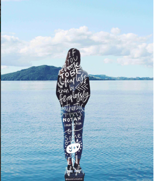
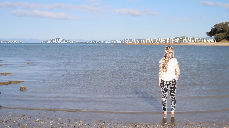
Great designs tell a story, I would like the objects I am involved in creating to have the flare and flavour of my personality and values.

I looked into many companies mission and value statement to see if I identify or contrast with them.

My flat mate who is currently siting in my room and applying for journalism jobs made this interesting observation of the contrast of mission statements between the leading media companies in New Zealand NZME commenting on how they just wish to be the first and the fastest at delivering news to New Zealanders, ( did you forget the values of the most accurate or relevant?) however the others seem to incorporate more integrity and audience focus into their statement.

Media works: Our team is committed to creating and delivering great content, experiences and results for our audiences and customers. We believe in being the best in connecting, enriching and inspiring Kiwis every day.

TVNZ: Our purpose is to make a difference by sharing the moments that matter to New Zealanders.


The Invision App, which I have never used, or heard of, shares their likeminded values:

Invision App: “Question Assumptions. Think Deeply. Iterate as a Lifestyle. Details, Details. Design is Everywhere. Integrity.”

Screen_Shot_2014-08-14_at_5.44.25_PM

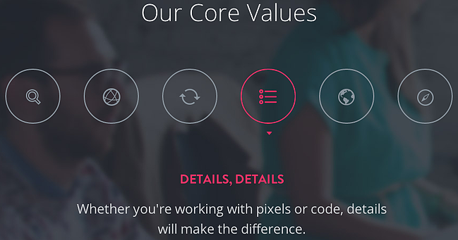
The invision example inspired me to think about doing the small things well, being committed to doing a good job no matter the amount of responsibility, the credit or money you will receive.


My Core Values/DNA:

Faithfulness: Do the small things well, details matter, a thousand dollar person sometimes has to do a $100 job, wherever you are; be all there.

Friend, create the environment you wish to work in, yes its about the product but people are more important, always welcome with a smile, a voice of reason and sincerity, never let your attitude be a barrier to someone elses win.

Forward focussed, (felt like I had to stay with the F’s but not the best title) Take regular jumps, learn something new, ask questions, take opportunities and seek advice, never stay stagnant, research and read, readers are leaders.

Fruitful, produce on time, on brief, on budget. Be people orientated, how can I help this client win? Keep them wanting more.

Fair, put people in positions where they will grow, regularly check in with team members, celebrate peoples successes, lend a hand in peoples struggles.

Fufillment, check your heart regularly, is this still fulfilling me? avoid stress, go where you’re gonna grow, are you achieving goal, burnout is too far, busy is not ok, have time for people around you.

Mission Satement: Work in progress

Be faithful in the small, remember people matter, be a positive influence in every workplace I enter into and create good stuff.

Lastly, I watched this ted talk about the importance of community in implementing change with specific reference to Natan the founder of the modern day SPCA who through his values connected with other community members in San Fransisco created a shift in treatment of abandoned animals.


Week 11: Collage as Design Analysis.

For this weeks in class assignment using collage as design analysis, I decided to expand on a project I researched in Story. My research project was designing advertising material for a childrens camp. The design is a collage of many icons that appeal to children as fun with the overlay of the word BRAVE. I researched this design and envisioned what I wanted it to look like but it was never realised. However, today for my collage analysis I have decided to put feet to my design.

The analysis is really of what makes up a childrens idea of fun, what gets them excited.

Below is my concept drawing and development process:

screen-shot-2016-10-18-at-4-57-50-pmscreen-shot-2016-10-18-at-4-58-14-pmfinal

I started with just doing a collage and used more yellow images than other colours. I finally added the writing over top in trash hand font in white. I also played round with the different colour hues, and I think this would look cool as a series of different colours. The only thing I would of done differently was to make sure all the icons were the same texture including the writing.

Week 10: Every Object Tells a Story

This week I was hugely inspired by an creative Instagram account called Lauren.creative. I like the way that she incorporates typography into images as a border or shape words in a way that is becomes the object or focal point. I would really like to do something similar for this weeks assignment.

screen-shot-2016-10-10-at-5-01-09-pmscreen-shot-2016-10-10-at-5-04-20-pmscreen-shot-2016-10-10-at-5-04-35-pm

I attempted to recreate the wing image but using moving picture and some footage I previously took of my sister at Maraetai Beach where we live.

I tried to choose a font that was youthful but relaxed that would reflect the beach scenery.

However it proved too time consuming and I believe I was too ambitious, and unskilled to accomplish the dream.

I opted for placing the writing within the body and on the mountains.

Here is the final image. I chose the white font as it was a clear but gentle contrast still keeping with natural colours, in contrast to a primary colour, and black I thought would be too harsh. I found the font was relaxed and worked with the beach vibe; it almost seems hand written. I also like how it stretched and moulded to the hills in the background.

typography

The text I chose is a Psalm from the the bible, psalm 95 is a poem written about the craft work of Gods hands in forming the dry land and the separation from the sea.

For the Lord is the great God,
    the great King above all gods.
 In his hand are the depths of the earth,
    and the mountain peaks belong to him.
The sea is his, for he made it,
    and his hands formed the dry land.

Come, let us bow down in worship,
    let us kneel before the Lord our Maker;
for he is our God
    and we are the people of his pasture,
    the flock under his care.

I chose this particular passage because of the two lines I have highlighted. Nothing makes me feel as small as when I stand beside the sea and I am forced to question that there must be something bigger than me. Scale helps portray this in the image.

I wish I had had the time to develop my first idea of making a rotoscope image of words forming wings in the moving picture.

Week 9: Lighting and Photography

I used many different types of lighting in this exercise including day light on a overcast day, a iPhone torch, a candle/fire, house lighting, my laptop screen and diffused lighting through thin yellow curtains.

I learnt that the different lighting can create different moods in the picture, just as warm and cool light.

I need to work on my photography skills and learn more about settings on a camera however, for this exercise I used my iPhone camera.

This expertise was also helpful in filming our interviews for our project especially with tim as we interviewed him in his office which was large tinted windows which gave a artificial blue tint to the room.

Warm house light bulb

img_0295

iPad screen light, cool and dull.

img_0296

Candle light

img_0293

Day light on a overcast day

img_0290

Iphone touch light. This is my favourite image.

img_0291

Day light diffused through lemon curtains.

img_0294

Candle light again

img_0292

Story: Week 9 (21st September)

In 2013 I was given the awesome opportunity to stay in Israel for 15 days as a school trip.

Whilst on our trip we visited the The Holocaust History Museum – Yad Vashem. The museum was the place that cause the most emotion for me, although I don’t know of any relations who were effected by the NAZI genocide of jewish people it was the first time I felt like I had a connection to it. Being in the homeland of the Jewish people whose family were directly effected by this tragedy you would feel that it meant something so much more to them compared to far away New Zealanders.

The Museum architecturally was beautiful and their creative visualisation of data made the lives lost seem real, tragic and beautiful at the same time.

“A decade in the making, the Holocaust History Museum combines the best of Yad Vashem’s expertise, resources and state-of-the-art exhibits to take Holocaust remembrance well into the 21st century.”

http://www.yadvashem.org/yv/en/museum/overview.asp#!prettyPhoto

0304

Unfortunately you are unable to take photos in the museum but you may have seen the photo of many shoes of victim that were taken from a concentration camp, there are thousands of shoes all under a glass flour as you first walk in, it was a shock as it wasn’t the first thing you saw until you looked down, it shocked me and I wanted to get off that part of the floor asap as I felt like I was standing on peoples personal belonging only to remember that these people no longer live.

However the most beautiful visual collection of data in my opinion was the childrens memorial hall of mirrors pictured below.

Designed by architect Moshe Safdie.

02ee381f281228ccc7b4eb0ebd0af83f

This is a seperate building to the museum and is internal filled with mirrors and black flooring. One candle is lit and is reflected thousands and thousands of times by the mirrors to create a scene that resembles a stary night sky. This was to represent the amount of childrens lives alone that were taken during the holocaust. A speaker continually reads out names of children and their age, the list of victims names (1.5 million children) takes days to read out.

“This unique memorial, hollowed out from an underground cavern, is a tribute to the approximately 1.5 million Jewish children who were murdered during the Holocaust. Memorial candles, a customary Jewish tradition to remember the dead, are reflected infinitely in a dark and somber space, creating the impression of millions of stars shining in the firmament. The names of murdered children, their ages and countries of origin can be heard in the background.”

I enjoyed this exhibition especially because the tragedy of the event is depicted so beautifully, it is peaceful and a space for remembrance rather than causing anger to build up.

PROF/ENTER Week 9 (20th September)

In the first half of our class today Geraldine was presenting possible elective pathways within the BCE in order to inform us in choosing electives for 2017. She asked us to write down a list of possible classes we would like to take.

Chris has repeatedly informed us and convinced us of the rapidly growing industry area of ecommerce, hence I wrote down the elective I would like to take centred around graphic design particularly in digital publication, marketing including social networking and fashion. I think these skills would be extremely useful to enter into the ecommerce world.

Our endeavour of creating our own ecommerce site will be promoting and a great thing to have on our cv and in our portfolios.

Throughout this class however, I have remained myself about not dabbling in other teams areas. I specifically chose to be in the brand team as it was a skill I wasn’t extremely family with but wanted to develop. I already have a portfolio of social networks and site design so decided to be with the branding team. In the process I have tried to offer as less advice as possible in order to concentrate on my own team, keep my nose out of their business but also for everyone to ‘create the monster’ as Chris calls it.

I think our idea of creating a brief of brand guidelines specifically for the web development team was very effective and maybe we can look to do this for other groups also.

screen-shot-2016-11-14-at-9-42-59-pm